Franklin's Five and Dime
More than any other building in the restless town of Naughtright, this one has likely suffered the most for all of the changes the town has endured. They're all based on the Miller Engineering K.C.'s Hardware kit, and consequently I would up purchasing six or seven of the kits (I've lost count). Fortunately I was able to recycle many of the leftovers into other projects, including the passenger station, the pharmacy, and even the hotel. Follow along as I recap the five lives of the five and dime.
Version 1 consisted of two kits grafted together, with a single-story extension tacked on the back.
Version 2 (no photo) was a single building with one end wall angled to meet the next building at the corner in the middle of town.
Version 3 (also no photo) was just a straight build of an unmodified kit.
Version 4 was the actually very close to how I'd envisioned the building from the very beginning—back during the days of the first version of the layout (you can see it in the lower right corner of the second drawing). The difference was that the back wall wasn't parallel to either of the front walls, which ultimately led to the demise of the design.
Version 5 was a partial rebuild of Version 4: I removed the back wall and replaced it with two shorter wall segments, each of which parallels the corresponding front wall. Sadly, the sign I made for Version 1 couldn't be used because it was too long, so two new signs were in order—which also brought about the name change.
All versions followed my usual procedures for bashing brass buildings. The only unusual step required in version 5 was cutting a wall apart in situ. Fortunately I found that a good pair of shears did the job fairly well, although the was some minor curling as a consequence, which is why my preference is still a big old paper cutter.
I still to try and solder parts as often as feasible; it may sound like overkill, but it offers advantages over bonding with CA. For example, I soldered the chimneys together. First, after folding the add-on detail parts, I soldered them by applying liquid flux, then simply touching the soldering iron tip to one corner; the solder quickly wicks to all of the joints. Then, after sanding the open side of this part flush, I clamped it to the building, and soldered it in place by applying the iron tip to the bottom of the part where it meets the wall. Again, the solder wicks around to all of the joints. Finally, I sanded all of the exposed joint edges smooth and flush to make a perfectly seamless assembly. Try that with a part attached with just CA!
Since the five and dime was a significant foreground structure, I added some extra detailing to compensate for the overly-flat look of etched brass. This included new window lintels from Micron Art (#91901), and strip styrene sills. The cornice, however, was quite plain, being just strip styrene; not all cornices were elaborate, and based on my research into old Woolworth stores, most seemed to be architecturally understated. Besides, this added variety to a street where most of the other buildings had ornate detailing.
Finishing began with a mustard-colored spray paint. I'd intended for this building to be this color since day one, as I wanted it to stand out a little from the sea of red brick surrounding it. A thin wash of India Ink brought up the mortar lines and toned down the brilliance.
The storefront got a somewhat gaudy color scheme of bright red and pale yellow. While I personally find the color scheme mildly revolting, it is in keeping with style of architecture when the store might have been in its prime—the sixties (the layout is set in the seventies). The cornice, window lintels and sills were all left mustardy so as not to create a complete color circus. Some powdered chalk weathering and a final, fairly heavy application of Dull Cote helped tie everything together.
After finishing the exterior painting, I made a pair of new signs the same way I'd made the original Woolworth sign: I bonded brass letters from Scale Link to a strip of brass fret material. After spraying the signs with bright red paint, I lightly sanded the paint off of the lettering, then sealed the finished sign with Dull Cote, which toned down the brass color of the letters nicely.
Ultimately, however, the sign was not used, as the building wound up being modeled as abandoned. I filled the commercial space with store furniture from Luetke Modellbahn, which I dirtied up with an India ink wash. The result reinforces the layout's era: the seventies, a time when many businesses failed and towns deteriorated. It's not necessarily pleasant to see (just as some modelers object to graffiti), but it is reality.
This is the original Micro Structures K.C.'s Hardware kit.

Version 1 was a straight-line grafting of two kits with an extension out back.

Made for the Version 1 storefront, sadly this sign cannot be used.

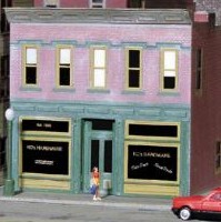
Version 4 featured two kits joined on an angle, with a single straight back wall.

Version 5 is the same as Version 4 except the back walls parallel the front.

The walls were cut according to a carefully-measured drawing.

The chimney detail parts are bent and soldered together.

A chimney part is clamped in place on the wall and soldered.

The edges of the joints of the chimney are all sanded flush and smooth.

Styrene wall caps are bonded in place to support a new sloped roof.

The primed shell is placed in position on the layout for evaluation.

Mustard-colored paint (Tamiya Dark Yellow, TS-3) is applied.

The color scheme is far from pleasing, but it suits the building and the era.

The interior is filled with the detritus of a closed business.
![]()
![]()
Copyright © 2007-2013 by
David K. Smith. All Rights Reserved.
Miller Engineering product photo used with permission.