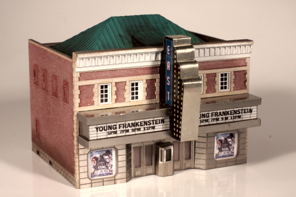
Movie Theater Marquee
The Miller Engineering Crestline Theater kit ought to have been the natural starting point for the East Theater, but in a strange twist of irony, I wound up using the theater kit for the firehouse, and most of the firehouse kit for the theater! But it was a much longer road to completion for the theater than the firehouse.
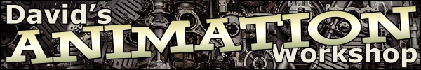
Although Naughtright is hardly a ritzy community, I still wanted to give the theater an Art Nouveau-ish look. So to the internet I turned to search for images of interesting older downtown theaters. Luckily I had no end of hits in this department, and based on the dizzying variety I found, I concluded that I could make up just about anything I wanted and it would probably pass as believable. Things really started to click when I stumbled across a theater that vaguely appeared as if part of Miller Engineering's car wash kit was grafted onto the lower half of an old town hall building.
Since its marquee constitutes the "essence" of a theater, I started the project by building it first, with the intention of "wrapping" a building around it. This turned out to be something of a necessity, since the dimensions of certain key marquee components would be impractical to adjust.
But just getting started was an almost painfully slow process. It seemed as if I'd spent months repeatedly sifting through a heap of stainless steel kit parts: the Pink Elephant Car Wash, the City Scoop, and the original Crestline Theater kit. I had this gut feeling that somewhere in that pile was a movie theater facade waiting to be discovered.
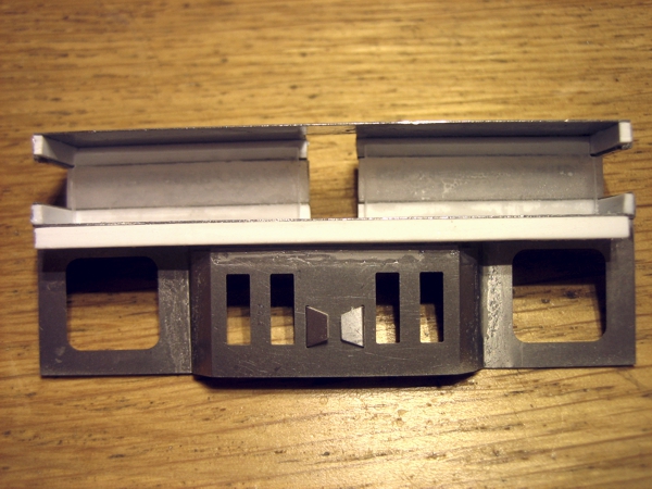
Meanwhile, I was having almost as much trouble designing the main sign. I was torn: chaser lights, similar to the original theater add-on lighting kit, or an animated neon sign from Light Works USA (Miller Engineering)? Using both together, I felt, would be overkill—too many blinking lights (I already have another animated neon sign planned for the Triangle Bar, which is right across the street from the theater). Not to mention that there would be lots and lots and lots of tiny holes to drill! The neon sign would be a quicker solution, plus it had the tall vertical style that I wanted.
The smallest animated vertical neon sign appropriate for the structure that Miller Engineering makes, however, is way too big for Z scale, but I thought it could be cut down (yes, really) to something a little more reasonable. I used my big old paper cutter (the one I use to cut etched brass parts) to chop off the bottom sign panel as well as the smaller round one that projects out the side. The result is still somewhat large, but much more acceptable.
As I often seem do with my projects, however, I had to make the animated sign twice. Designing the marquee as I went resulted in a fair bit of abuse to the signs, which they're not designed to tolerate. Ultimately one of the two signs failed, so I ordered a new pair. This time, knowing in advance exactly what to do, I was able to keep the manipulation down to a minimum.
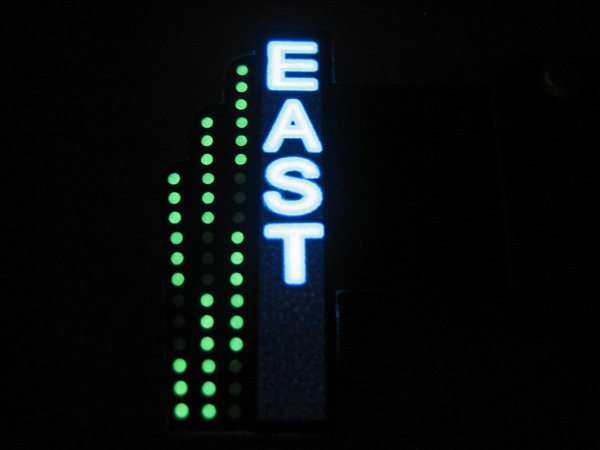
I also revised how I made the lettering. Originally I'd made decals to make the theater name, but because they were ink-jet printed, they weren't very dense, and it took two decals laminated together to keep the black areas black. When the replacement signs arrived, I noticed that I could make the same name using one of the supplied graphic stickers: TASTEE thus became EAST with just a few knife cuts.
As I finally started piecing the marquee itself together, I kept returning to the Pink Elephant Car Wash kit, with its over-the-top quasi-Art Nouveau styling; I could see a pair of the rounded-corner windows serving as poster display areas to either side of the entrance. But it really started to click when I focused on the narrow roof over the car wash office/waiting area: a sandwich of two of these parts, with lighted movie title signs in between, might look convincing.
Once I started down a particular path, with a particular set of selected parts, it became something of a great big Chinese puzzle, with many dimensional interdependencies. The animated sign, for instance, dictated the spacing between the horizontal marquee parts, and hence the height of the movie title signs, while the depth of the horizontal parts was governed by where the animated sign connector was positioned. The spacing of the two animated signs was adjusted to fit the existing notches originally meant for a big pink elephant. Together with the entrance doors and the displays to either side, the overall size of the marquee finally became firmly established—and thence dictated exactly how the building would be modified to fit the marquee.
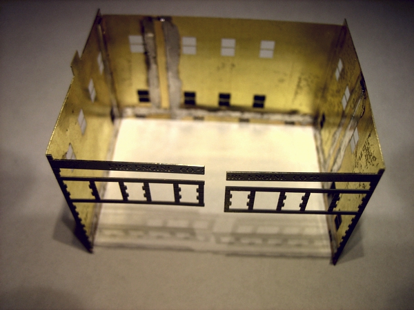
The horizontal marquee parts were laminated to sheet styrene, and the top part was notched to accept the animated neon sign. The movie titles were rendered on white decal material and applied to clear styrene, which was then sandwiched between the top and bottom sign parts. The height of the plastic movie title pieces had to be set to space the stainless parts such that they matched the height of the lower portion of the animated signs, between the connector and the bottom edge.
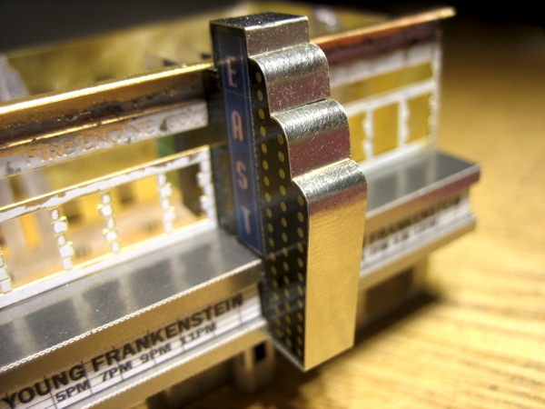
The two animated signs were sandwiched together with two pieces of double-stick foam tape and a piece of sheet styrene such that the assembly matched the width of the notch in the marquee, which originally accommodated the big pink elephant sign. The bottom of the non-animated portion of the neon sign would be embedded inside the marquee to make everything as compact as possible, so that the animated sign didn't appear grossly oversized.
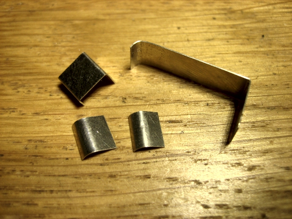
The single most difficult step in making the sign was edging it with stainless steel. Fortunately I have an obscene collection of etched metal products, and among some Ndetail.de N scale detailing kits were some perfectly-sized frets; not only that, the stainless was much thinner and easier to work than that of the Micro Engineering kits. Because the bottom of the sign was embedded in the marquee, the edging was attached to the sign after the facade was assembled.
After trying a gaggle of alternatives, I wound up using the original theater entrance doors from the newer stainless steel version of the Crestline Theater kit (it was originally brass). The doors were flanked by a pair of windows extracted from the car wash kit, and capped with a strip of plain car wash wall material. These four pieces were bonded together with CA and reinforced with a strip of thick styrene along the top, which also served as a means of attaching the entrance sub-assembly to the sign sub-assembly.
The little ticket booth proved to be a sticking point. The original stainless steel theater kit ticket booth was unattractive and very difficult to bend owing to its small size. I was going to make a new one using the front of City Scoop kit, which looked like a natural choice, but it was too wide. Then I tried making it out of a leftover car wash door, but it still looked too much like a door. Ultimately I used the original theater ticket booth. It's not ideal, but it works; tucked under the marquee overhang, its imperfections go unnoticed for the most part.
To be honest, I wasn't sure this little Frankenstein's Monster was going to work. I felt that the animated sign was too big, the marquee was too squat, and the entrance too much of a kluge. It wasn't until I started actually assembling the marquee—while frequently flipping through my stockpile of reference images to make sure I wasn't crazy—that I began feeling confident enough to press on with the project.
|
|
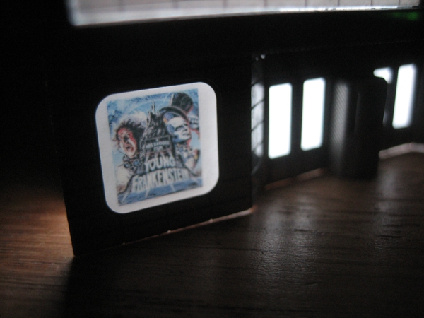
As for the featured film, I felt as if the theater was increasingly taking on the qualities of a Frankenstein's Monster, comprising bits and pieces from five or more kits. Then it dawned on me that I ought to somehow "immortalize" that quality via the film being featured, and Young Frankenstein immediately came to mind. This inspiration was followed by a flurry of fact-checking to be sure it would work. The film was released in December 1974.