
Cutting Corners
If it's not evident by now, my goals in designing the house have been:
- functionally meeting my living requirements;
- maximizing my enjoyment of the setting;
- integrating it into the environment;
- satisfying a design sense.
Frequently the last item is the first one on the list for architects and their clients. For me, it's a distant fourth because, even though I do have a strong aesthetic sense, bending a design to suit a particular style ultimately serves no purpose other than to impress others. I have no inclination to impress anyone, and I live alone in an isolated area, so my home is out of sight. Plus, "designer" structures are nearly always costlier to build.
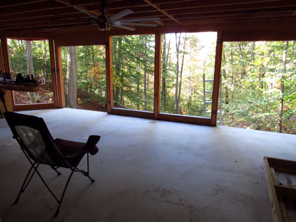
But my home isn't entirely devoid of some design sense, and the most prevalent element I employ is the angled corner. The decision to use this motif emerged from my design for the living space: by angling the corners of the windowed wall, it makes the space feel larger—an optical illusion created by the sense of "pushing" the room out into the outside space—and provides a more immersive connection with the environment.
Angled corners also work well in other circumstances; in particular, I've always felt that outside corners within interior spaces seem severe and invasive. (I'd prefer rounded corners, but they're challenging and costly to build.) Once I started down this path, I saw opportunities to use them all over the place. Here's where I applied the design element:
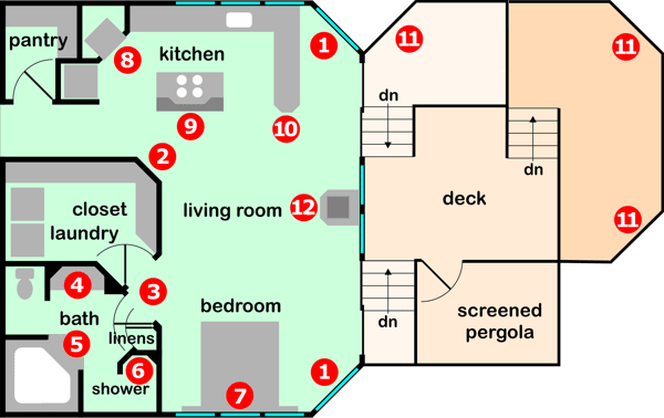
1. The corners of the main living space—the genesis of the design element.
2. The corner of the closet/laundry where it meets the living space. This was the first place I applied the design after the windowed wall, with the intent to "soften" the corner. It also opens up the space more by increasing the angle of view from the end of the hallway into the living area.
3. The closet/laundry and bathroom doors. This arrangement is explored more thoroughly in Problem Solving.
4. The bathroom sink. This grew out of a need to enclose the waste drain vent stack within the triangular space to the left of the sink; the countertop was made symmetrical with the addition of the triangular shape to the right, which also encloses the bathroom HVAC vent, and places the light switches within easy reach of the door.
5. The bathtub. This part of the bathroom saw many revisions before I finally realized a corner soaking tub was absolutely perfect for the space in every way (one of those classic face-palm moments). The open edge of the tub forms an angled face, as do the steps leading up to the tub.
6. The shower. For a long time—indeed, nearly up to the very end—it had all rounded corners; switching to angled corners made it fit better, both structurally and aesthetically, and made it much more practical to build.
7. The headboard. Here, the angled corners are horizontal.
8. The oven in the kitchen. This is explored more thoroughly in Problem Solving.
 9. The backsplash of the kitchen island.
10. The end of the floating breakfast bar.
11. The deck.
12. The wood stove pedestal.
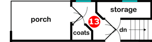
13. The angled corners of the coat closet and Kitty Central ("storage," above) in the foyer make more efficient use of space: both storage areas get to be larger without sacrificing smooth egress through the foyer to The Grand Gallery.
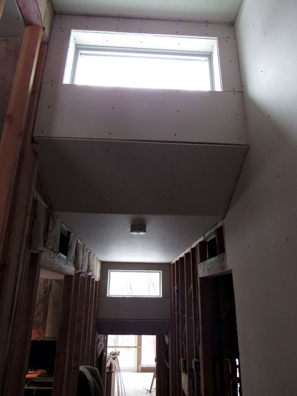
As well as: Angled ceiling transitions in the office (below left) and Kitty Central (below right), and the ceiling transitions between levels in The Grand Gallery (bottom).
I know that my home will never appear in House Beautiful or Architectural Digest (as if I really cared), but at least it won't show up at McMansion Hell—an awesome website that leaves me in stitches!
Also see: Unusual Touches
Where I Don't Cut Corners
I have a strong aesthetic about construction and finished surfaces: no "fake" materials. There's no faux wood grain, for example. Or fake stone. Wood is always real wood; tile is real tile, etcetera. I may use tile that looks vaguely like wood, but there's no chipboard with a printed vinyl surface. There's no "engineered flooring" (e.g., Pergo). The closest I come to a faux finish is, for example, the suspended light tracks in the kitchen, which are finished with a metallic paint, even though I'd have preferred stripping off the paint and wire-brushing the metal underneath—which I may do someday (although I have no option to do anything about items that are plastic, such as outlets and light switches). My goal, as much as is practical, is to always have "authentic" finishes on all surfaces.